Designed and built a landing page for Kakos

We created a landing website for our client, a B2B marketplace for Wildberries sellers.

Project stages

01

Create an informative landing page for new users.

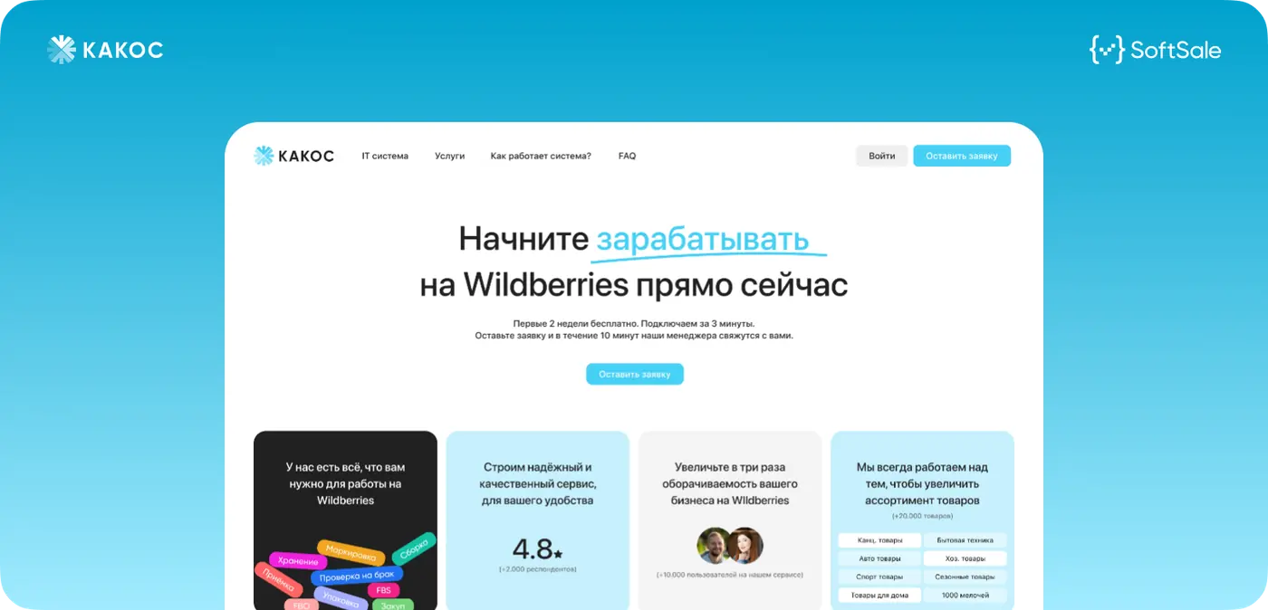
The Kakos team came to us with the task of designing and developing a landing page for the B2B marketplace ka-kos.com.

The product itself had already been developed by us earlier, so we understood its logic, value and key scenarios well. That gave us an advantage. We did not spend time onboarding into the product and immediately focused on how to package it correctly and communicate its value to new users.

The main task was to make a page that quickly explains how the platform works, what problems it solves and why a business should start using it.

kakos

02

We structured the product value and built the right narrative for the landing page.

The Kakos platform solves several important tasks for Wildberries sellers at once, but the key point was how to communicate that.

We started by classifying all benefits and prioritizing them. It was important not just to list features, but to build the logic so that the user sees answers to their main pains from the first screens.

First come the values that directly solve the sellers’ key problems. Then come additional product capabilities and advantages. This approach helps catch the user faster and increase conversion: the person immediately understands that the product solves their task and continues exploring.

kakos

03

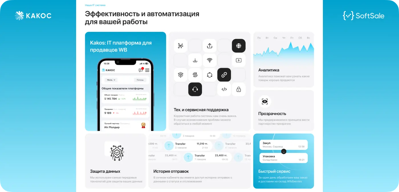
We preserved the style and identity of the Kakos platform and carefully transferred it to the landing page.

The Kakos branding had also been developed by our team several years earlier, so we understood the product’s visual language well and did not spend time on immersion.

Our task was not just to “draw a landing page,” but to make it an organic continuation of the whole platform. We preserved the key identity elements while updating the presentation and making it more modern and easier to perceive.

The design approach was wider than working on one page. We treated the landing page as part of a larger product, a logical continuation of the ecosystem where everything must be connected and work in a single style.

Because of this, the page does not look like a separate element, but naturally fits into the overall Kakos product.

Kakos landing page

04

The result is a strong hook for new Kakos users.

The landing page became modern, lively and clear from the first seconds. It solves its main task: quickly explains the product value, answers key user questions and holds attention.

The user immediately sees what problem the platform solves and how exactly it can be useful in their work. Thanks to the right structure and presentation, the information is easy to perceive without overload.

As a result, the landing page became a full entry point into the product: it does not just talk about the platform, but helps convert new users and leads them to the next step, starting work with the system.

In fact, this is not just a page, but a working tool that strengthens marketing and helps the business scale.

CTO SoftSale

Maksat Kantai

CTO “SoftSale”

On this project, it was important for us not just to show the product from the outside, but to correctly convey the logic of the platform itself and the value it gives sellers in daily work.

Kakos solves several business tasks at once, so the main focus was making sure the user quickly understands how the service works, which processes it simplifies and why it helps them work more efficiently.

Because we knew the product from the inside and had already worked with its architecture and business logic, it was important to preserve that integrity in the presentation. The page had to reflect not a single function, but a system where everything is connected and works as one tool for B2B scenarios.

In the end, we made a solution that communicates the platform’s strengths more clearly, strengthens trust in the product and simplifies entry for new users.

Shall we discuss your project?

What do you need?